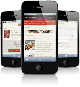
Give your visitors a delightful browsing experience on their mobile device as well.

The penetration of smart phones has now exceed 50% of all mobile devices. Smart phones are connected to the Internet non-stop, which means people browse the net on the go, wherever they may be.
The immense popularity of iPhones, Andoid phones, and other smart phones taught people to perform a lot of web related tasks on the mobile device.
Yes, this includes searching for restaurants, and ordering out. Mobile is everything these days, and if you don’t have a mobile-friendly version of your restaurant/bar website, you could be missing out on a huge audience.
Your site’s mobile optimized version
MyRestaurantTheme automatically detects mobile devices like iPhones, iPads, Android and hundreds more, than shows the user a mobile-optimized version of your site, instead of your regular desktop site.
What makes the mobile version of your site great?
- Small screen optimized: Your content is automatically formatted differently, making it look good on the smaller screens of smart phones. Sidebars are not shown
- Download times: The connection speeds and processing power of mobile devices is not as high as desktops, therefore smaller image versions, and lighter CSS is served to the smart phone, allowing for much faster load times.
- Freedom to choose: Visitors can always switch back to your full site with a link at the bottom of the screen if they choose.
- Online ordering: Your restaurant’s online ordering system is optimized for mobile devices as well, so your customers will be able to place orders on their smart phones as well.
- Mobile reservations: The table reservation system of your site is fully functional and optimized for mobile devices as well.


